You’re 1000 times more likely to die from a snail than a shark!
Sitting increases disease risk… and exercise may not reduce it!
Exercise During Teenage Years Lowers Risk Of Cancer Death Later In Life!
Sleeping Less Than Six Hours A Night Increases The Risks Of An Early Death!
Death and heart disease risks increased with trans fats, not saturated fats!
You’ve seen the news headlines. You’ve been scared (and maybe confused)! But haven’t you wondered how they calculated these ‘facts?’ By the end of this post, you’ll understand.
Relative Risk: what’s the risk and what’s relative?
The above headlines all reference studies that came to these conclusions by calculating the relative risk (well, I’m not sure if the snail headline really counts…). Determining the relative risk or risk ratio is a common method used in clinical trials to determine which group has the higher rate of disease.
This is actually a relatively simple calculation to make. It is just dividing two probabilities.
Here’s what we need:
Usually we have two groups (but it can be more), classified by treatment, intervention or some other classification, each group with its own probability of having some event of interest occur. This event must either occur or not occur.
For example, let’s assume that some researchers gathered data on death by snails. They follow two groups for 10 years, one comprised of people who have snails as pets, and one who have dogs. Each group has 1000 people. At the end of the study they collect data and find that in the snails group, 200 people have died whereas in the dog group, 150 people have died. To get this into a probability, we just divide the number of people who died by the total number of people.
Extra terminology bonus: the snail study would be an example of a prospective cohort study.
Snail group sample probability of event occurrence: 20/1000 = 0.02
Dog group sample probability of event occurrence: 15/1000 = 0.015
These probabilities or proportions are also called the incidence rate.
Now we can calculate the relative risk (also called the relative risk ratio or risk ratio).

In general:

Usually the group with the exposure or treatment of interest being studied goes in the numerator. In the previous example, we are interested in the snail group so they go in the numerator.

We interpret the relative risk of 1.3333 as meaning that you are 1.3333 times more likely to die if you have snails as pets, than if you have dogs. Or your risk of dying is 33% higher if you have snails as pets than if you have dogs.
We could reverse the ratio, 0.15/0.2. Then we just interpret it as you are 0.75 times less likely to die if you have snails as pets, than if you have dogs. Or your risk of dying is 25% less if you have snails as pets than if you have dogs.
What if the probabilities are equal? Let’s say, snails and dogs both produced probabilities of 0.02. Then the relative risk is 1. It’s important to note that a relative risk of 1 means indicates no difference.
Ah, so the headline above regarding death and heart disease risks increasing with trans fat, but not saturated fat would mean that the relative risk for trans fat consumption must have been greater than 1, and the relative risk for saturated fat must have been close to 1. Yes, exactly!
But which groups are we comparing? Those who ate saturated fat versus those who didn’t? Impossible! Even apples have a very small amounts of saturated fat.
So what do we do?
Relative to whom?
A common way to group subjects in order to produce a relative risk is by dividing subjects into different categories, usually based on the amount of some numeric variable. In the saturated fat example, the researchers divided the groups by the amount of saturated fat consumed. So the comparison becomes subjects who consumed higher amounts of saturated fat versus lower amounts of saturated fat. The relative risk ratio compares these two groups.
Sometimes multiple groups are compared. For example: they divide the subjects into 5 categories, by intake of saturated fat, and compared the lowest fifth of saturated fat intake to each other fifth.
Data Visualization
Let’s take a look at some relative risks from the actual study referenced above. This is actually a meta-analysis, a study of studies, or research about previous research which combines the findings from independent studies to determine if there is a pattern. Often it’s used to solidify conclusions or to clarify contrasting results. The following table summarizes the findings of this meta-analysis.
 You can see the relative risk and the visualization of it, under the Risk ratio label, with the confidence intervals. I won’t go into confidence intervals much here, but in short a confidence interval (CI) is a “range of values that describes the uncertainty surrounding an estimate.” In this case, the estimate is the risk ratio. The 95% CI means that if we were to repeat the same experiment/study with a new sample (new subjects) we would expect that 95% of the time the estimate would fall within the CI range.
Look at the Outcome column, and read the All cause mortality row. The Relative risk (95% CI) for that outcome is 0.99. This is the point estimate for the relative risk and the range in the parentheses is the confidence interval (0.91 to 1.09). Why 95%? It’s the agreed upon reasonable range, corresponding to the 0.05 p-value significance level that we discussed in a previous post.
The blue square with the horizontal line coming out of it is the point estimate for the relative risk, and the horizontal line represents the confidence interval. Does the blue line include 1? Yes.
In the chart we can see a vertical line at the risk ratio of 1. Remember a risk ratio of 1 means no difference i.e. high levels of saturated fat intake produce the same risk in all cause mortality (death for any reason) than low levels of saturated fat intake. If the CI range includes 1, then we conclude that saturated fat is “not associated with” the outcomes (CHD, All-cause mortality, Type-2 diabetes…etc).
Please note that regardless of some attention grabbing headlines you may have read, whether or not a risk ratio’s CI includes 1 does not necessarily mean that the variable we are looking at causes anything. We can only say that it is associated or not associated with something else. Here we cannot say that saturated fat does not cause an increase in all-cause mortality, we can only say that it is not associated with it. It is an important distinction. Association does not imply causation. This is a very complicated subject and merits a future post.
The blue square with the horizontal line coming out of it is the point estimate for the relative risk, and the horizontal line represents the confidence interval. Does the blue line include 1? Yes.
The P column corresponds to the significance level of the relative risk ratio. Remember the convention that a p-value of less than 0.05 is statistically significant. The 
Look again at the All cause mortality row. Where is the blue square? A little more than 1. What is the relative risk shown in the next column? 0.99. Yes, they made a mistake in their chart. It happens, even in the top scientific journals in the world.
Let’s make the plot!
I am not going to exactly replicate the chart above, but I will show something similar, produced in R. If you want to make something exactly like the plot above you probably need to use Adobe Illustrator to modify your plot. The plot we’ll produce will be fine for our purposes.
Here is the plot we’ll make:
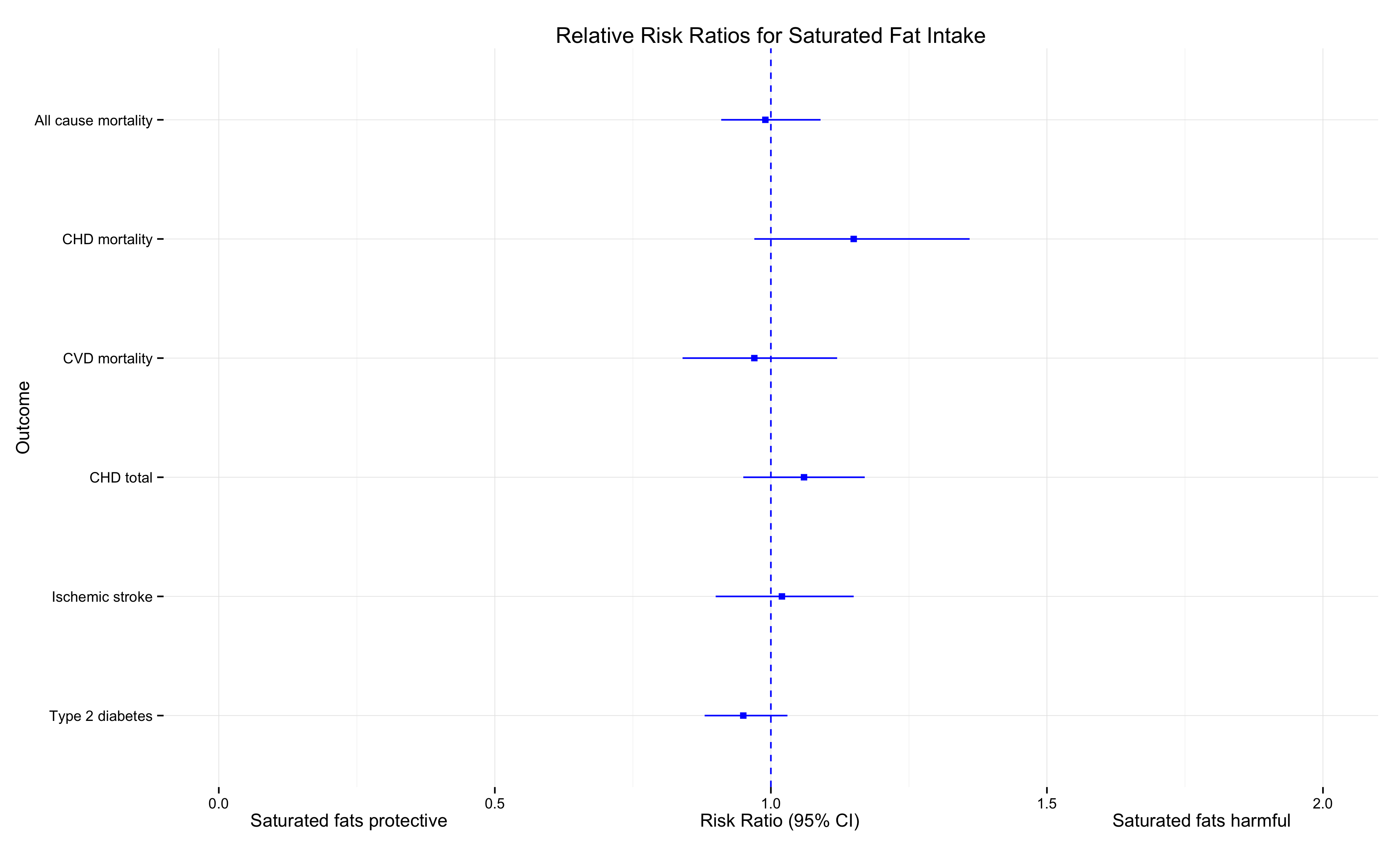
Looks similar, no?
The code to make the plot is pretty straightforward. We won’t make the risk ratios or confidence intervals from the raw data. We can just take them from the summary data displayed in the actual chart. Let’s begin.
First load or install and load the required packages.
library(ggplot2)
library(ggthemes)
Now make a data frame of the data we need. This was copied directly from the actual chart. Since we are using the ggplot2 package, the data should be put in a data frame.
x = c("Type 2 diabetes","Ischemic stroke","CHD total","CVD mortality","CHD mortality","All cause mortality")
y = c(0.95, 1.02, 1.06, 0.97, 1.15, 0.99)
ylo = y-c(0.07, 0.12, 0.11, 0.13, 0.18, 0.08)
yhi=y+c(0.08, 0.13, 0.11, 0.15, 0.21, 0.10)

sat_fat=data.frame(x,y,ylo,yhi)
The variable ‘y’ is the point estimate, and ‘ylo’ and ‘yhi’ are the range for the confidence interval.
Now we’ll do something a little strange.
sat_fat$x = as.character(sat_fat$x)

sat_fat$x = factor(sat_fat$x, levels=unique(sat_fat$x))
The above code is necessary to get ggplot2 to display the variables in the desired order. We are just coding the sat_fat data frame to be displayed in alphabetical order, as in the actual chart.
The next bit of code produces the chart. Notice a few things. We use the function ‘geom_pointrange’ to display the CI range. We need to use ‘coord_flip’ to change the axes. This is because we can’t state a range for the x axis in ggplot (ymin and ymax state the range for the geom_pointrange). And sorry for the ineloquent code for displaying the x axis label (coded as ylab because of the coordinate flip). This was just the easiest way to do it. Looks OK though!
p=ggplot(sat_fat, aes(x=x, y=y, ymin=ylo, ymax=yhi))+
  geom_pointrange(color="blue",shape=15) +
  coord_flip()+geom_hline(aes(yintercept = 1),color="blue",linetype=2)+
  ggtitle("Relative Risk Ratios for Saturated Fat Intake")+
  xlab("Outcome")+ylim(0,2)+theme_minimal()+
  ylab("Saturated fats protective                                                  Risk Ratio (95% CI)                                                  Saturated fats harmful")
p
The code all together:
library(ggplot2)
library(ggthemes)

x = c("Type 2 diabetes","Ischemic stroke","CHD total","CVD mortality","CHD mortality","All cause mortality")
y = c(0.95, 1.02, 1.06, 0.97, 1.15, 0.99)
ylo = y-c(0.07, 0.12, 0.11, 0.13, 0.18, 0.08)
yhi=y+c(0.08, 0.13, 0.11, 0.15, 0.21, 0.10)

sat_fat=data.frame(x,y,ylo,yhi)
sat_fat$x <- factor(sat_fat$x, levels=unique(sat_fat$x))

p=ggplot(sat_fat, aes(x=x, y=y, ymin=ylo, ymax=yhi))+
  geom_pointrange(color="blue",shape=15) +
  coord_flip()+geom_hline(aes(yintercept = 1),color="blue",linetype=2)+
  ggtitle("Relative Risk Ratios for Saturated Fat Intake")+
  xlab("Outcome")+ylim(0,2)+theme_minimal()+
  ylab("Saturated fats protective                                                  Risk Ratio (95% CI)                                                  Saturated fats harmful")
p

ggsave("RR.png",scale=1.2)
Your Turn
Here’s the chart from the same article regarding trans fat. Now you’re well-equipped to read and understand the chart. Notice how many of the blue lines do not cross 1. I recommend reading the original article. It’s interesting to see where the headlines come from.

Summary
Here are the most important take-aways:
1) The relative risk ratio compares the probability of event occurrence between two or more groups.
2) If the risk ratio’s 95% Confidence Interval includes 1, then we conclude that there is no difference in risk for the groups compared.
3) If the risk ratio’s 95% Confidence Interval does not include 1, then we conclude that there is a difference in risk for the groups compared.
4) If the risk ratio is greater than 1, then the exposure or new treatment being studied is associated with greater risk.
5) If the risk ratio is less than 1, then the exposure or new treatment being studied is associated with less risk.
6) Snails are deadlier than saturated fat.

2 thoughts on “Relative Risk (Risk Ratios)”