From the previous post, we understand that Odds Ratios (OR) and Risk Ratios (RR) can sometimes, but not always be interpreted in the same way. We even saw that scientific studies made the mistake of interpreting odds ratios as risk ratios. I have even seen the OR interpreted as a RR in a scientific journal article with the title “The Odds Ratio: calculation, usage and interpretation.” Unfortunately this is the third search result from Google for the search “Odds Ratio.” In the article the author states that
The result of an odds ratio is interpreted as follows: The patients who received standard care died 3.71 times more often than patients treated with the new drug.
No, that’s the interpretation of a risk ratio! The correct interpretation of an odds ratio is: The patients who received standard care had an odds of dying 3.71 times more than patients treated with the new drug. You must be clear that it is the odds of dying that are being compared. Otherwise it is a risk ratio, which is not the same calculation.
But does it really matter? How similar or different are they? They must be close enough if professionals misinterpret them, right?
We’re going to explore that here by going through some calculations.
The Exploration
For ease of explanation, we will look at a situation with an incidence rate of 0.25. We’ll go through the calculations for the Risk Ratio and the Odds ratio at a few different levels.
The data we will use is made-up, but similar to the data we looked at in the previous post about women walking. Here’s the table:
| Exposure | Non-exposure | |
| Event occurs | 250 | 250 |
| Event doesn’t occur | 750 | 750 |
| Total | 1000 | 1000 |
First let’s calculate the incidence rate. Remember the equation is:

Here, the number of event occurrences is 250, and the number of possible event occurrences is 1000, for both the exposure and non-exposure groups. So our incidence rate is just 250/1000 = 0.25.
All of the following calculations will be made with a 0.25 incidence rate for the non-exposed group.
Now let’s review the equations for the RR and the OR:

To get to that step we need to use these equations:

Note that we are using the shortcut to calculate the OR, meaning that a*d ≠ odds of group 1.
Which is from the generalization of the table:
| Exposure | Non-exposure | |
| Event occurs | a | b |
| Event doesn’t occur | c | d |
Note that you may see the above table in a different form (e.g. the columns are event occurrence and the rows are exposure). This doesn’t change the results if we are consistent with the letters a, b, c, and d. The result may be inverted if the exposure and non-exposure columns are exchanged.
Now we are ready to make some calculations!
The Similar: RR and OR near 1
For this calculation, we will use the exact table above, with equal incidence rates for both groups. Subbing in the numbers for the letters in the equations we get:


Here, and for any RR near 1, the OR will also be near 1.
The Slightly Similar (Dissimilar)
For this calculation, we will change the table above to:
| Exposure | Non-exposure | |
| Event occurs | 500 | 250 |
| Event doesn’t occur | 500 | 750 |
| Total | 1000 | 1000 |
Notice that the incidence rate for the non-exposure group is still 0.25, but it has doubled for the exposure group has doubled. Probably you can work out in your head that the OR will now double as well, so the OR = 2.
NO! Just testing.
The RR will be 2! Let’s go through the calculations as we did above.


Whoah! OR of 3 and a RR of 2?! That’s different. Not very different, but definitely different.
The Very Different
For the last calculation we’ll change the table to:
| Exposure | Non-exposure | |
| Event occurs | 750 | 250 |
| Event doesn’t occur | 250 | 750 |
| Total | 1000 | 1000 |
As above, same incidence rate for the non-exposure group, but now tripled for the exposure group. The calculations are:


That’s quite a difference!
Clearly, as the RR gets further from 1, the OR increases at a much higher rate.
Visualization
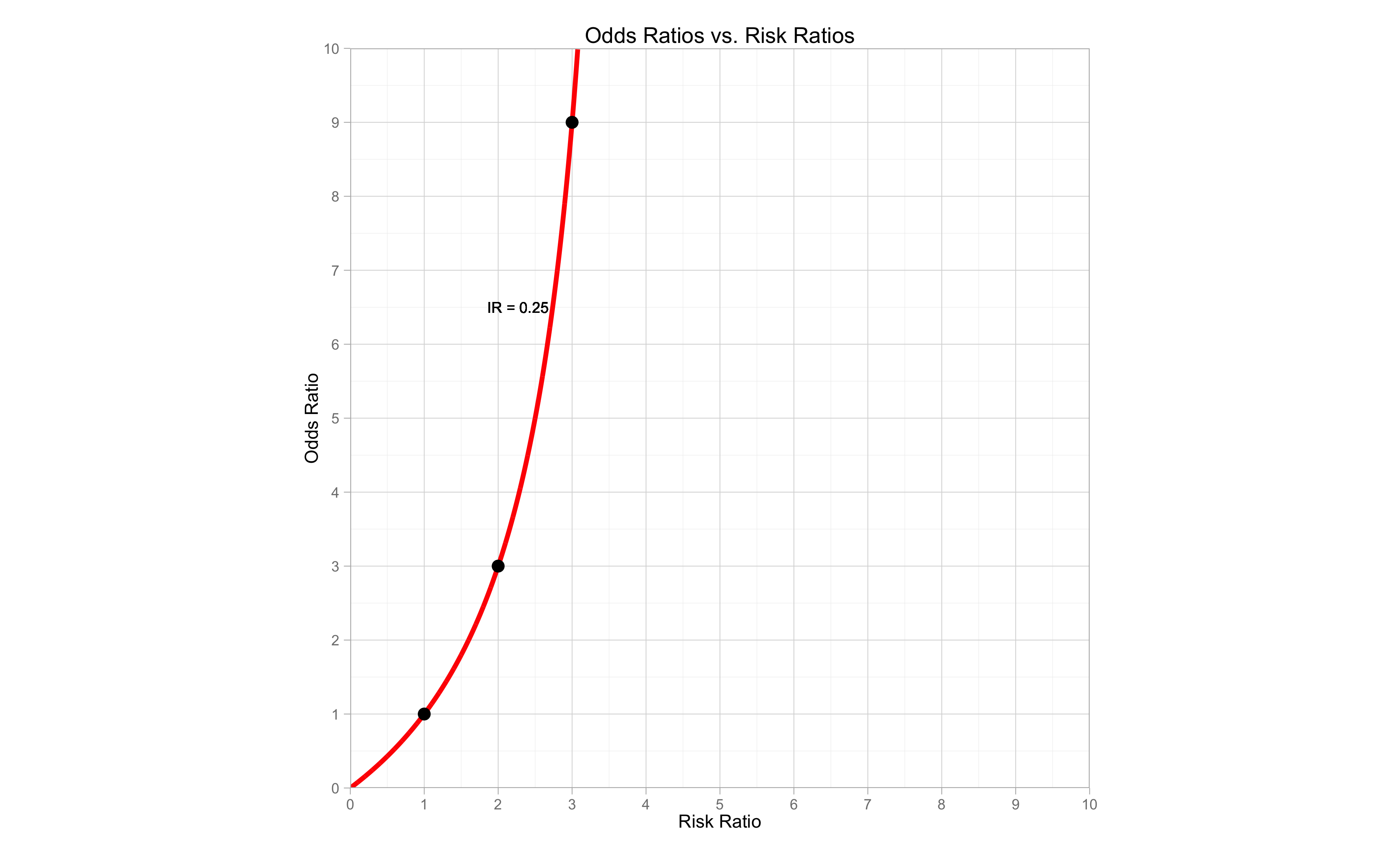
Let’s visualize this difference. Below is a graph of the OR vs the RR. The y-axis is the OR and the x-axis is the RR. Notice the three points on the graph. They are exactly what we calculated above: OR of 1, 3, and 9, and a RR of 1, 2, and 3. The line represents what would happen if we made that calculation at each point possible. Eventually, the line become vertical and the OR is infinite, however we would see that the RR does not pass 4 if we extended the graph.
Remember that this graph represents the OR vs. RR at an incidence rate for the non-exposure group of 0.25. When we have different incidence rates, the comparison between the OR and RR will be different. Sometimes it will be more similar, sometimes more different.
The Full Comparison
The following graph is much the same as the one above, however now it includes the comparison for different incidence rates of the non-exposure group. Each line represents a different incidence rate, shown next to the line. We have 5 incidence rates, 0.5, 0.25, 0.1, 0.05 and 0.01. The diagonal dashed line represents the OR being equal to the RR. That would only happen when there was virtually a 0 incidence rate.
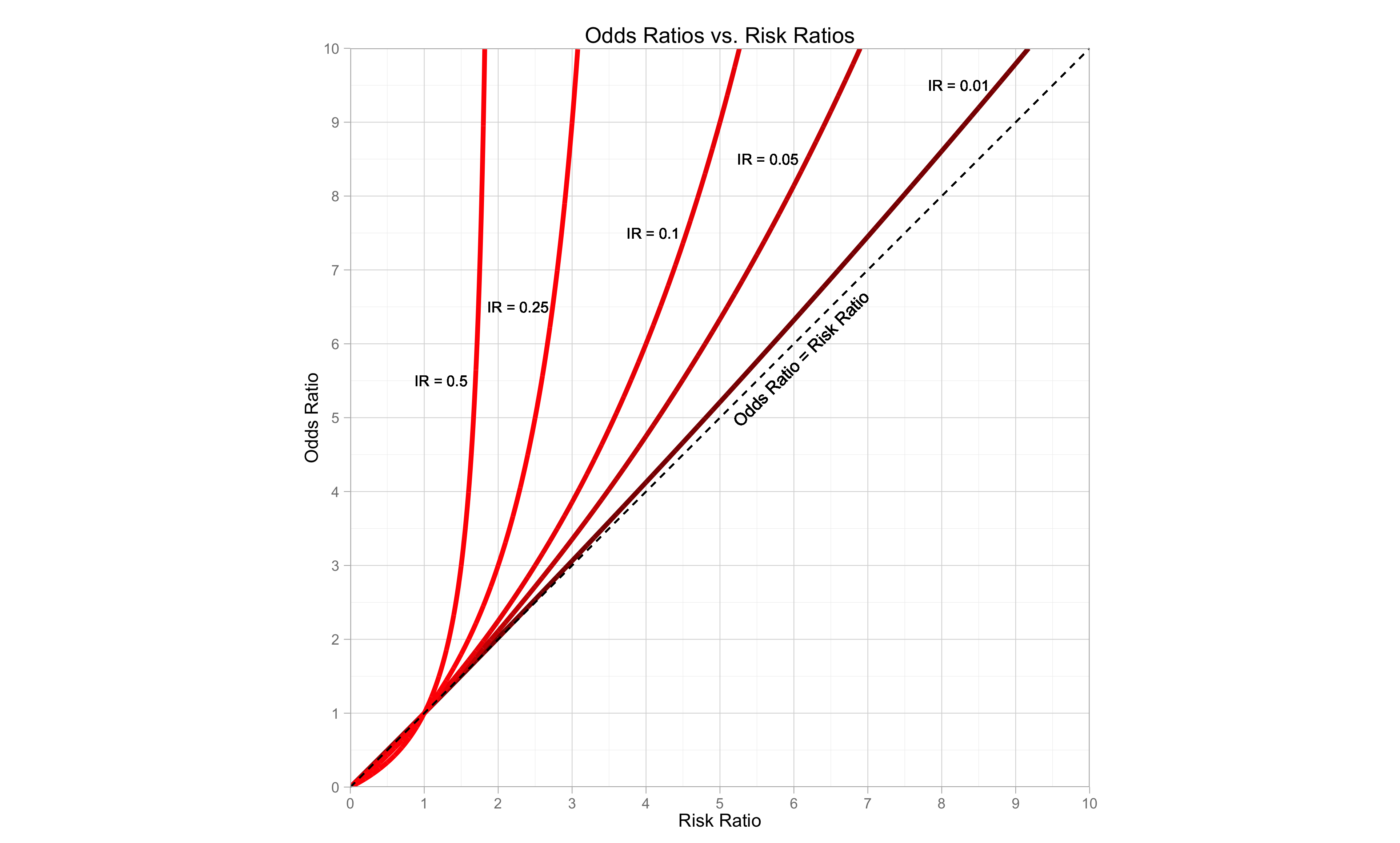 We can clearly see that as the incidence rate for the non-exposure gets smaller, the difference between the OR and the RR gets smaller.
Remember in the previous post, I said that if the incidence rate is less than 0.1 then we can interpret the OR in the same way as the RR? Well, the graph shows why we can do that, but also shows that we need to be careful about doing so. If the OR gets higher, then the difference between the OR and RR becomes greater.
Creating the Graphs
The construction of the graph is just building the comparisons of the OR and RR exactly as we did above, but for each point on a sequence of very small intervals. We can do this in R without difficulty.
Here is the process for the first incidence rate of 0.01:
Set up a sequence from 0 to 10 by the interval of 0.001. This will help us to calculate the ORs and RRs for each point on the line.
i0 = seq(0,10, by = 0.001)
We will use this in the following calculation:
First we need our b the number of event occurrences in the non-exposure group (remember the table with a,b,c,d) because that will remain fixed in each incidence rate. Here c will be 10, since we have 1000 possible occurrences. That means there is an incidence rate of 10/1000 or 0.01.
I01 = 10
b = rep(I01,length(i0))
We set the number of occurrences to be 10, then repeat it for as many times as are in our sequence above. That is our c for this line.
To calculate d, just need to subtract b from 1000.
d = 1000-b
This does it for every point in the sequence.
Now we need to calculate a. Remember that a represents the number of occurrences in the exposure group. We want a to show the different ORs vs RRs. By using the sequence above, I0, we multiply b by each point in the sequence. This will be our a. It will change for each point in the sequence.
a = b*i0
And c is just the total possible occurrences minus a.
c = 1000-a
It may look a bit strange, and you may have to spend a little time thinking about how this was constructed (I sure did!). This calculation is redone for each line, with only changing the initial incidence rate for the non-exposure group.
To get the OR and RR for each line, we just use the familiar equations:
OR01 = (a*d)/(b*c)
RR01 = (a/(a+c))/(b/(b+d))
Actually, since we have pretty much the same calculation for each incidence rate it would be easier to create a function. The following code creates a function in which you just need to enter the desired incidence rate.
Note that there is one change because for the higher incidence rates, the calculation for a eventually results in more than 1000. This is impossible, as it can’t be more than the total number of possible occurrences, so we just have to set every value above 1000, to be equal to 1000.
ORvRR=function(inc_rate){
  i0 = seq(0,10, by = 0.001)
  I01 = inc_rate*1000
  b = rep(I01,length(i0))
  d = 1000-b
  a = b*i0
  a[a > 1000]= 1000 # here is where we set values above 1000 to equal 1000
  c = 1000-a
  OR = (a*d)/(b*c)
  RR = (a/(a+c))/(b/(b+d))

  ORRR=data.frame(OR,RR)
  return(ORRR)
}
Now we can just use the function to create all the ORs and RRs for each incidence rate and put them in a data frame for ggplot.
c1=ORvRR(0.01)
c2=ORvRR(0.05)
c3=ORvRR(0.1)
c4=ORvRR(0.25)
c5=ORvRR(0.5)

df=data.frame(c1,c2,c3,c4,c5)
Now we are ready for ggplot.
library(ggplot2)
library(ggthemes)

p = ggplot(df) + scale_x_continuous(breaks=0:10,limits=c(0,10),expand = c(0,0))+scale_y_continuous(breaks=0:10,limits=c(0,10),expand = c(0,0))
p = p + geom_line(aes(x=RR,y=OR),color="red4",size=1.5)
p = p + geom_line(aes(x=RR.1,y=OR.1),color="red3",size=1.5)
p = p + geom_line(aes(x=RR.2,y=OR.2),color="red2",size=1.5)
p = p + geom_line(aes(x=RR.3,y=OR.3),color="red1",size=1.5)
p = p + geom_line(aes(x=RR.4,y=OR.4),color="red",size=1.5)
p = p + theme_light() + ggtitle("Odds Ratios vs. Risk Ratios")
p = p + geom_segment(aes(x=0,y=0,xend=10,yend=10),linetype=2)
p = p + ylab("Odds Ratio") + xlab("Risk Ratio")
p = p + coord_equal(ratio=1)
p = p + geom_text(x = 1.23, y = 5.5, label = "IR = 0.5", size=3.5)
p = p + geom_text(x = 2.27, y = 6.5, label = "IR = 0.25", size=3.5)
p = p + geom_text(x = 4.1, y = 7.5, label = "IR = 0.1", size=3.5)
p = p + geom_text(x = 5.65, y = 8.5, label = "IR = 0.05", size=3.5)
p = p + geom_text(x = 8.23, y = 9.5, label = "IR = 0.01", size=3.5)
p = p + geom_text(x = 6.1, y = 5.8, angle = 45, label = "Odds Ratio = Risk Ratio", size=4)
The expand option makes ggplot have no space after the limit of the graph axes, just for aesthetics. The coord_equal(ratio=1) makes the graph a square so we can see the comparison between the OR and RR optimally.
Conclusion
When calculated using the same data:
- the OR and the RR can give us very similar or very different results depending on the incidence rate
- high incidence rate = OR is much larger than RR
- low incidence rate = OR is similar (but still larger than RR)
- as the RR increases, the OR increases at a higher rate for all incidence rates
- the OR always overestimates the RR
- OR is larger than RR if > 1
- OR is smaller than RR if < 1)
In short, it does matter!
Hopefully now you have a clearer understand of why it matters.
Remember though, that if the OR and RR are interpreted correctly, there are situations in which both can be used, even with the same data. For ease of interpretation, I’d suggest that you use the risk ratio whenever possible.
The Code
All of the code to produce both graphs is shown below.
ORvRR=function(inc_rate){
  i0 = seq(0,10, by = 0.001)
  I01 = inc_rate*1000
  b = rep(I01,length(i0))
  d = 1000-b
  a = b*i0
  a[a > 1000]= 1000
  c = 1000-a
  OR = (a*d)/(b*c)
  RR = (a/(a+c))/(b/(b+d))

  ORRR=data.frame(OR,RR)
  return(ORRR)
}

c1=ORvRR(0.01)
c2=ORvRR(0.05)
c3=ORvRR(0.1)
c4=ORvRR(0.25)
c5=ORvRR(0.5)

df=data.frame(c1,c2,c3,c4,c5)

library(ggplot2)
library(ggthemes)

p = ggplot(df) + scale_x_continuous(breaks=0:10,limits=c(0,10),expand = c(0,0))+scale_y_continuous(breaks=0:10,limits=c(0,10),expand = c(0,0))
p = p + geom_line(aes(x=RR,y=OR),color="red4",size=1.5)
p = p + geom_line(aes(x=RR.1,y=OR.1),color="red3",size=1.5)
p = p + geom_line(aes(x=RR.2,y=OR.2),color="red2",size=1.5)
p = p + geom_line(aes(x=RR.3,y=OR.3),color="red1",size=1.5)
p = p + geom_line(aes(x=RR.4,y=OR.4),color="red",size=1.5)
p = p + theme_light() + ggtitle("Odds Ratios vs. Risk Ratios")
p = p + geom_segment(aes(x=0,y=0,xend=10,yend=10),linetype=2)
p = p + ylab("Odds Ratio") + xlab("Risk Ratio")
p = p + coord_equal(ratio=1)
p = p + geom_text(x = 1.23, y = 5.5, label = "IR = 0.5", size=3.5)
p = p + geom_text(x = 2.27, y = 6.5, label = "IR = 0.25", size=3.5)
p = p + geom_text(x = 4.1, y = 7.5, label = "IR = 0.1", size=3.5)
p = p + geom_text(x = 5.65, y = 8.5, label = "IR = 0.05", size=3.5)
p = p + geom_text(x = 8.23, y = 9.5, label = "IR = 0.01", size=3.5)
p = p + geom_text(x = 6.1, y = 5.8, angle = 45, label = "Odds Ratio = Risk Ratio", size=4)

ggsave("ORvRR.png",scale=1.2)

# the following produces the 1st plot, with our 3 calculation points

calcOR = c(1,3,9)
calcRR = c(1,2,3)
dfcalc=data.frame(calcRR,calcOR)


p25 = ggplot(df) + scale_x_continuous(breaks=0:10,limits=c(0,10),expand = c(0,0))+scale_y_continuous(breaks=0:10,limits=c(0,10),expand = c(0,0))
p25 = p25 + geom_line(aes(x=RR.3,y=OR.3),color="red1",size=1.5)
p25 = p25 + geom_point(data=dfcalc,aes(x=calcRR,y=calcOR),size=4)
p25 = p25 + theme_light() + ggtitle("Odds Ratios vs. Risk Ratios")
p25 = p25 + ylab("Odds Ratio") + xlab("Risk Ratio")
p25 = p25 + coord_equal(ratio=1)
p25 = p25 + geom_text(x = 2.27, y = 6.5, label = "IR = 0.25", size=3.5)
p25

ggsave("ORvRR25.png",scale=1.2)
P.S.
I mentioned in the beginning of the post that an OR of 3.71 was misinterpreted as a RR in scientific journal article explaining the OR. Using the same data, the RR would have been 2.68.
If you want to try the calculation yourself the data used in the article was:a = 152
b = 17
c = 248
d = 103Enjoy!

Thank you so much! Very helpful!
LikeLike